©2026 ZenABM - All Rights Reserved.

LinkedIn carousel ads get just 2.73% of total ad budget across the 211 companies I analyzed in our 2026 LinkedIn ABM benchmarks report. I used to hate on this format as well (thinking the UX was bad and people wouldn’t swipe it) – but that was a mistake. Carousel ads generate 25% higher dwell time than single image ads. They have a 0.32% median CTR – slightly lower than single image ads at 0.42% – but with a hidden advantage that most of us completely overlook: card-level engagement means that collectively across all cards, carousel ads can push your effective CTR above 2% for the most engaged viewers.
So – they work. I’ve seen great engagement on them. And in this guide, I will break down everything I have learned about LinkedIn carousel ads from analyzing $5.5M in LinkedIn ad spend across 160k ads. You will learn the exact card-level performance data, the winning carousel formula, and why this format deserves 10-15% of your budget instead of the 2.73% it currently gets. Here is what you will learn:


LinkedIn carousel ads are a swipeable ad format that lets you display 2 to 10 image cards in a single ad unit. Each card can have its own headline, description, and destination URL. Users swipe through the cards horizontally in their feed on mobile, or click arrows on desktop. Think of them as a mini-presentation inside the LinkedIn feed. Instead of communicating one message with a single image, you get multiple frames to tell a story, showcase different benefits, or walk someone through a process:

The format works on both desktop and mobile feeds. Unlike single image ads where you get one shot to capture attention, carousels give you a sequential experience. That changes how people engage with your content – and how you should design it.
If you have just 2 minutes to read this post – here’s what you should definitely know about LinkedIn Carousel ads to make them work for your ABM program:
| Winning Formula | Specs & Setup Essentials | Best Practices | Best Use Cases | Measurement Framework | Core Takeaways |
|---|---|---|---|---|---|
| Card 1: Hook • Pattern interrupt • Curiosity-driven headline • Bold stat, provocative question, or meme • Do NOT sell • Do NOT place CTA Goal: Get the swipe. Cards 2–3: Value • Data insights • Testimonials with metrics • Mini frameworks • Before/after comparisons Goal: Build trust and expertise. Cards 4–5: Convert • Strongest CTA • Clear offer • Social proof + next step • Urgency or scarcity Viewers here are 7–10x more likely to click. |
• 2–10 cards (Recommended: 4–5) • 1080×1080 (1:1 ratio) • JPG/PNG under 10MB • 45-character headline per card • Up to 255 intro text (150 recommended) • Each card can link to a different URL Design Tips: • Use the full square space • Avoid small text • Design for mobile first |
• Design for the swipe, not the click • Keep on-card text minimal (2–3 key points) • Use 4–5 cards maximum (99% of impressions happen on Cards 1–3) • Make Card 1 visually different • Put strongest CTA on Card 4 or 5 • Use different landing pages per card based on engagement level |
Use Carousels For: • Multi-step storytelling • Case studies • Product walkthroughs • Educational frameworks • ABM awareness campaigns Avoid Carousels For: • Simple single-offer promotions • Small budgets (<$3K/month) • Warm retargeting audiences (use single image instead) |
Do not rely only on blended metrics. Track: • Card-level impression share • Swipe-through rate (Card 1 → Card 2) • Card-level CTR • Cost per LP click by card Advanced ABM Insight: • Track which companies swipe through multiple cards (e.g. with ZenABM’s company-level engagement insights) • Deep swipes signal high intent even without clicks • Use engagement depth to trigger sales outreach |
• Carousel ads are LinkedIn’s most underused format • Blended CTR hides the real power of card-level engagement • Later cards drive exponentially higher click rates • Structure matters more than design polish • Optimized sequences can double performance • Higher dwell time makes them ideal for ABM |
Here is what carousel ads actually deliver, based on 44 carousel ads from our dataset of 160k LinkedIn ads across 211 companies and $5.5M in spend.
| Metric | Carousel Ads | Single Image Ads | Video Ads |
|---|---|---|---|
| Median CTR | 0.32% | 0.42% | 0.24% |
| Median CPC | $13.30 | $13.23 | $15.61 |
| Median CPM | $45.28 | $47.43 | $36.50 |
| Dwell Time | 4.56s | 3.65s | varies |
| Budget Share | 2.73% | 41.42% | 19.55% |
At first glance, carousel CTR looks lower than single image. That is misleading. The 0.32% CTR is a blended average across all cards. When you dig into card-level data, the story changes dramatically.  Carousel ads also deliver 25% higher dwell time (4.56s vs 3.65s for single image). That means your message gets more attention time per impression. For brand awareness and ABM campaigns, that additional time with your content matters.

This is where carousel ads get interesting. Most advertisers look at the blended 0.32% CTR and dismiss the format. But card-level data tells a completely different story. I dug into how engagement changes as users swipe through each card. The results were striking.
| Card Position | Impression Share | Weighted CTR | CTR Multiplier vs Card 1 |
|---|---|---|---|
| Card 1 | 76.32% | 0.117% | 1.0x (baseline) |
| Card 2 | 22.75% | 0.274% | 2.3x |
| Card 3 | 0.43% | 0.597% | 5.1x |
| Card 4 | 0.29% | 0.905% | 7.7x |
| Card 5 | 0.13% | 1.121% | 9.6x |
| Card 6 | 0.05% | 1.837% | 15.7x |
| Card 7 | 0.02% | 2.890% | 24.7x |
The pattern is clear: every swipe is a self-qualification signal. Someone who reaches Card 3 is 5x more likely to click than someone who only sees Card 1. By Card 7, they are nearly 25x more likely to click. 76% of viewers only see Card 1 and move on. That is fine. They were not your target buyer. The 24% who swipe are increasingly qualified, and the CTR curve proves it. This means your carousel strategy should not try to get everyone to click Card 1. It should be designed to earn the swipe, then convert high-intent swipers on later cards.
When you optimize card sequences based on this data, the numbers shift significantly.
| Scenario | CTR | CPC | LP Clicks per $1,000 |
|---|---|---|---|
| Current Performance | 0.32% | $13.30 | 75 |
| Optimized Card Sequence | 0.6-0.8% | $11-13 | 120-150 |
| Improvement | +88-150% | -8-17% | +60-100% |
That is 60-100% more landing page clicks per $1,000 spent. The clicks also come from more qualified viewers since they self-selected by swiping through your content.
Based on the card-level data, here is the formula that works. I call it Hook, Value, Convert.
 Card 1 is not about getting a click. It is about getting your audience to swipe. 76% of viewers stop here, so your first card needs to break the scroll pattern (= be the so called “pattern interrupt”) and create curiosity about what comes next. What works for Card 1:
Do not put your CTA on Card 1. Do not try to sell on Card 1. Just earn the swipe.
 Viewers who reach Card 2 or 3 are 2-5x more engaged. Give them substance.
These cards build trust and demonstrate expertise. The viewer is leaning in – reward them with real value.
 Viewers here are 7-10x more likely to click than Card 1 viewers. This is where you place your strongest CTA.
| Card | Content Type | Example | Expected CTR |
|---|---|---|---|
| 1 | Hook | “LinkedIn ads not working? Here’s why…” [Meme or bold visual] | Earn swipe |
| 2 | Insight | “We analyzed 2,828 ads. The pattern is clear:” [Data visual] | ~0.27% |
| 3 | Social Proof | Real customer testimonial with results | ~0.60% |
| 4 | Offer + CTA | “Get FREE strategy session (10 spots left)” | ~0.91% |
Before you design your carousel, here are the specs you need to follow.
| Spec | Requirement |
|---|---|
| Number of cards | 2-10 (I recommend 4-5 based on engagement data) |
| Image size | 1080 x 1080 px (square, 1:1 ratio) |
| File format | JPG or PNG |
| Max file size | 10 MB per card |
| Intro text | Up to 255 characters (150 recommended) |
| Card headline | Up to 45 characters per card |
| Destination URL | Each card can link to a different URL |
| CTA buttons | Available for Lead Gen Form objectives |
A few practical notes. The 1:1 square format takes up more feed space than single image ads, which use 1200×627. That extra space is one reason carousels catch attention. Use all of it – avoid designs with excessive white space or small text that gets lost on mobile.
Most advertisers design each carousel card as a standalone ad. That is the wrong approach. Design your cards as a sequence where each one naturally leads to the next. Use visual continuity – consistent colors, progressive numbering, or a visual element that spans multiple cards.
Each card is only 1080×1080 pixels. On mobile, that is small. Use large, readable fonts with a maximum of 2-3 key points per card. Let the visuals do the heavy lifting. The card headline below the image should complement, not repeat, the on-card text.
The data shows that 99% of impressions happen on Cards 1-3. Adding 10 cards does not help – it adds production time with almost zero additional reach. I recommend 4-5 cards: enough to tell a complete story, not so many that you waste creative effort.
Card 1 competes with everything else in the LinkedIn feed. It needs to stop the scroll. Use bold colors, unexpected visuals, or large text that creates curiosity. If Card 1 looks like a typical corporate ad, nobody swipes.
Remember the card-level data: viewers on Card 4-5 are 7-10x more likely to click. Do not waste your CTA on Card 1 where CTR is lowest. Build up value first, then convert on later cards.
Each card can link to a different URL. Use this. Send Card 2 viewers to an educational resource. Send Card 4 viewers to a demo booking page. Match the landing page to the viewer’s engagement level.
Carousels are not the right format for everything. Here is where they shine, and where you should use something else.
Here is the step-by-step process.
Standard Campaign Manager metrics only tell you blended performance. That is not enough for carousels. You need card-level data to understand where your sequence works and where it breaks down. Key metrics to track:
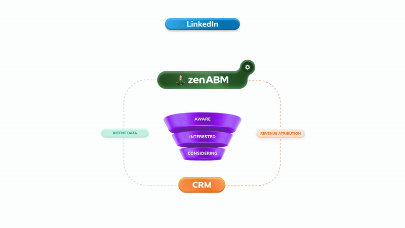
With ZenABM, you can also see which companies engage with your carousel ads at the account level. This is critical for ABM – knowing that a target account swiped through all 5 cards signals high intent, even if they did not click. That engagement data can trigger sales outreach or move accounts to the next stage in your ABM attribution model.
I recommend 4-5 cards based on the engagement data. 99% of impressions happen on Cards 1-3, so cards beyond 5 add production cost without meaningful reach. Use Card 1 as a hook, Cards 2-3 for value, and Cards 4-5 for conversion.
The median CTR for LinkedIn carousel ads is 0.32% based on our analysis of 44 carousels across $5.5M in spend. However, optimized carousel sequences can achieve 0.6-0.8% CTR – a 88-150% improvement over the median. Card-level CTR ranges from 0.117% on Card 1 to 2.890% on Card 7.
It depends on the use case. Carousel ads generate 25% higher dwell time and are better for storytelling, case studies, and educational content. Single image ads have higher blended CTR (0.42% vs 0.32%) and are simpler to produce. For ABM awareness campaigns, I recommend running both – single image for direct offers and carousels for multi-step narratives.
The median CPC for LinkedIn carousel ads is $13.30 and the median CPM is $45.28. That is comparable to single image ads ($13.23 CPC, $47.43 CPM) and cheaper than video ads ($15.61 CPC). With optimized card sequences, you can bring CPC down to $11-13 while increasing click volume.
Yes. Each carousel card can link to a different destination URL. I recommend using this strategically – send early-card clickers (less engaged) to educational content, and later-card clickers (highly engaged) to demo or signup pages. This matches the landing page experience to the viewer’s intent level.