![LinkedIn Single Image Ads: The Ultimate Guide [2026]](/_next/image?url=https%3A%2F%2Fwp.zenabm.com%2Fwp-content%2Fuploads%2F2026%2F01%2FLinkedIn-Single-Image-Ads-Ultimate-Guide-2026.png&w=1920&q=75)
LinkedIn single image ads are the workhorse of B2B advertising – and after running them for over 16 months across multiple ABM campaigns, I’ve learned exactly what makes them work. When I first started running single image ads as part of our LinkedIn ABM program, my CTR was hovering around 0.3%. Now, using the patterns I’ll share in this guide, our best-performing single image ads hit 0.8-1.2% CTR – and I’ve even seen some break 2%. The data behind this guide comes from my personal experience with LinkedIn image ads and analyzing ad performance across our customer base for the 2026 LinkedIn ABM Benchmarks Report. These aren’t just theoretical best practices – they’re patterns I’ve validated with real ad spend and real results: over $5M in influenced pipeline from $490k in ad spend.

If you’re running LinkedIn ads and wondering why your single image ads aren’t performing, this guide will show you exactly what’s working in 2026 – with real examples from campaigns that are generating pipeline right now.
Let me be honest about where I started. When I first launched single image ads as part of our Linkedin ABM campaigns, I made every mistake possible: generic stock photos of people shaking hands, walls of text crammed into images, no clear CTA. The results were painful – $15+ CPCs and CTRs that barely hit 0.2%. The turning point comes when you stop guessing and started analyzing. I pulled data from every ad format across our entire customer base into this report, bucketed them by CTR, and looked for patterns:  The single biggest insight?
Now, single image ads are a core part of our ABM strategy. They’re not as flashy as Thought Leader Ads (which hit 2.68% median CTR, and for us – 0.4% Clicks to Landing Page!), but they give you full creative control and the ability to test messaging quickly and are much easier to produce than videos. For mid-funnel education and bottom-funnel conversion, they’re often my first choice.
LinkedIn single image ads are Sponsored Content that combines one image with text to create a cohesive message. They appear natively in the LinkedIn feed – both desktop and mobile – making them less intrusive than display ads while still giving you control over the creative.  Key characteristics:
Single image ads are the most common format across all LinkedIn ad types. You’ve seen them everywhere in your feed – one image, headline, intro text, and a CTA button. The question is: what separates the ones you scroll past from the ones you actually click?
Here’s what 16 months of running LinkedIn single image ads taught me:
Ready to run LinkedIn single image ads that actually convert? Start with ZenABM to track which accounts engage with your campaigns and connect engagement to pipeline.
Getting your specs right is critical. I’ve seen campaigns underperform simply because the image was cropped wrong or the text got truncated. Here’s what LinkedIn requires for single image ads:
| Orientation | Minimum Size | Recommended Size | Aspect Ratio | Delivery |
|---|---|---|---|---|
| Horizontal | 640 x 360 px | 1200 x 628 px | 1.91:1 | Desktop + Mobile |
| Square | 360 x 360 px | 1200 x 1200 px | 1:1 | Desktop + Mobile |
| Vertical | 360 x 640 px | 628 x 1200 px or 720 x 900 px | 1:1.91 or 4:5 | Mobile Only |
File requirements:
My recommendation: I always use square (1:1) images at 1200 x 1200 px. They deliver best across both desktop and mobile, and take up more visual real estate in the feed. I made the mistake of using vertical images early on – then wondered why my reach was so low. Turns out desktop users (20% of my audience) never saw them.
| Element | Character Limit | Recommended Length |
|---|---|---|
| Ad name | 255 characters | Optional – internal only |
| Headline | 200 characters | 70 characters |
| Introductory text | 600 characters | 150 characters |
| Description (LAN only – although I don’t recommend LAN) | 300 characters | 70 characters |
Why 150 characters matters: LinkedIn truncates intro text above 150 characters with a “Read more” link. Here’s the costly mistake – every click on “Read more” counts as a charged click (!). You’re paying for curiosity, not intent. I learned this the hard way when I analyzed my campaigns and found 15-20% of clicks were going to text expansion, not my landing page. That’s wasted budget. Now I keep every intro text under 150 characters – front-load the important information, don’t bury the lead.
How do single image ads actually perform compared to other formats? Here’s the data from our 2026 LinkedIn ABM Benchmarks Report: 
| Metric | Single Image Ads | Thought Leader Ads | Carousel Ads | Video Ads |
|---|---|---|---|---|
| Median CTR | 0.42% | 2.68% | 0.32% | 0.24% |
| Median CPC | $13.23 | $2.29 | $13.30 | $15.61 |
| Efficiency Score | 3.2 | 9.5 | 2.4 | 1.5 |
Key insight: Single image ads have the second-highest CTR among traditional ad formats (excluding Thought Leader Ads). They outperform both carousel and video ads on cost-per-click efficiency. But here’s the opportunity – the gap between median (0.42%) and top performers (2%+) is massive. That’s where the patterns in this guide come in. 
Let me show you what’s actually working. I analyzed every single image ad that hit 2%+ CTR from our customer base and bucketed them by visual pattern. Here are the five patterns that consistently outperform: 
The image shows the problem visually, the headline promises the outcome, and the intro text bridges them. This works because it acknowledges the viewer’s pain before presenting the solution – which builds trust.  How to structure it:
I use this pattern heavily for awareness campaigns. Example: “Tired of manually syncing data between your CRM and LinkedIn?” resonates with someone experiencing that pain. “Our platform integrates with 50+ tools” – a feature list – doesn’t.
I was surprised by how well this works for B2B. We tend to think discounts and “FREE” are for B2C, but 41% of our high-CTR ads prominently feature a free offer or limited-time deal.  Key elements:
The specific deadline is key. Vague urgency (“Limited time!”) doesn’t work as well as a real date. I’ve tested this – ads with specific deadlines consistently outperform “hurry” language.
Diagrams, flowcharts, and visual explanations of playbooks and workflows work particularly well for complex B2B products where you need to show “how it works” quickly. Take this LinkedIn single image ad example:

Example formula: Integration flow diagrams showing Connect → Transform → Deliver.
Use a visual that simplifies a complex process into three scannable steps. This answers the “what does this product do?” question in 2 seconds – paragraphs of explanation can’t do that.
I use these heavily in mid-funnel campaigns where prospects know they have a problem but need to understand how different solutions work.
When you have strong social proof, use it – but do it right. Generic testimonials don’t work. Specific, verifiable ones do.  Required elements:
The named individual with their title is crucial. “Marketing Manager at [Company]” is infinitely more credible than an anonymous quote. I always push customers to let us use their name and title.
Product interface screenshots work (only) when your product is visually compelling and the screenshot tells a clear story – how to solve a specific problem the prospect cares about. E.g. take the example of this LinkedIn Single Image ad about ZenABM’s AI chatbot – Zena – helps understand pipeline impact of LinkedIn ads (also single image ads ofc!) without the need for building complex dashboards:  Key: The screenshot should show a meaningful outcome (data, results, a solved problem) – not just a feature in isolation. Showing the actual product helps prospects visualize using it. I always recommend cropping to the most impressive part of your interface rather than showing everything.
Based on my analysis of high-performing ads, here are the patterns that consistently work:
I can’t emphasize this enough: 0% of our top performers used generic stock photography. Overused stock images – handshakes, smiling business people in meetings, generic office scenes – signal “advertisement” before users even engage. They’ve been trained to scroll past them.  Instead, use:
I used to use stock photos before I analyzed the data – the difference when I switched to custom imagery was immediate. CTR jumped from 0.3% to 0.7% just from that change alone.
35% of top performers use dark backgrounds with neon/bright highlighted text. LinkedIn’s feed is mostly white/light – high contrast captures attention.  I now design most of my ads with dark backgrounds and neon green, yellow, or blue accent colors. They pop in the feed when everything around them is light and corporate.
47% of high-CTR ads include a prominent CTA button within the image itself – not just relying on LinkedIn’s default button. Use bright contrasting colors (neon green, yellow, blue) and make the action obvious. “FREE IMPLEMENTATION” or “GET STARTED” in a high-contrast button grabs attention.
LinkedIn’s feed is already text-heavy. Your headline and intro text carry the messaging – the image should be visual, not textual.
I tried cramming paragraphs of text into ad images early on. They looked cluttered and performed poorly. Now I aim for less than 20% text.
As Philip Ilic explains: “Make sure your budget matches your audience size. If you’re spending 2k/month and your audience is 300k people, no one’s seeing your stuff.”  The budget dilution problem kills more campaigns than bad creative. I made this mistake in my first quarter – running 15 campaigns with $500/month each. None of them worked. I consolidated into 6 campaigns and immediately saw results.
  My budget formula:
Here’s my actual process for creating single image ads:
What’s the one thing you want someone to remember after seeing this ad? Write that down first. The image serves the message – not the other way around.
Based on your message and funnel stage, pick one of the proven patterns:
Never launch with just one ad. I typically create:
The key is to start with a proven formula, then iterate based on your specific audience’s response. Don’t reinvent the wheel – model what’s already working.
Clicks and impressions don’t pay the bills. Before launching, make sure you can track:
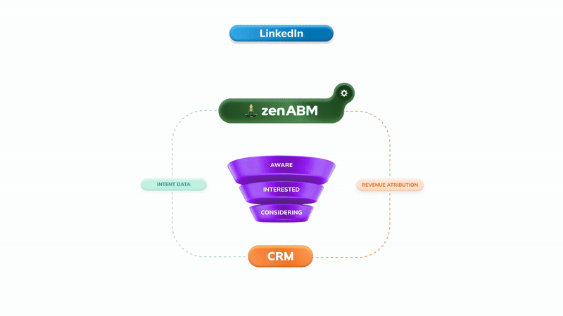
This is exactly why I built ZenABM – to connect LinkedIn ad engagement to pipeline at the account level. Standard LinkedIn-to-CRM connectors only push quantitative data (clicks, impressions) but miss the qualitative context (which specific campaigns accounts engaged with). Without this, you’re optimizing for vanity metrics. 

LinkedIn recommends testing 4-5 creative variations per campaign. Here’s how I structure tests:
With narrow ABM audiences, ad fatigue sets in fast. I refresh creative:
Let me save you some budget by sharing my failures:
This was my biggest early mistake. I’d launch 15 ads thinking “let’s test everything!” and each ad would get 50 impressions per day. That’s not a test – that’s noise.  Fix: Minimum $50-100/day per campaign. Maximum 4-6 ads per campaign. If you can’t afford that, run fewer campaigns.
CMOs and Marketing Managers have different priorities. One ad doesn’t fit all. C-Suite cares about revenue impact. Managers care about saving time on daily tasks. Same product, completely different message.  Fix: Create persona-specific campaigns with persona-specific creative.
Running the same ads for 6 months is a recipe for declining performance. ABM audiences are small – they’ll see your ads often. I now refresh monthly without exception. Fix: CTR-benchmark with 1000+ impressions refresh cadence. New images, new angles, new offers.
80% of LinkedIn traffic is mobile. I’ve run ads with text that’s unreadable on phones, CTAs that are too small to tap. Fix: Test every ad on mobile before launching. Make sure text is readable at thumb-scroll speed.
Focusing on form fills instead of account engagement. ABM success is measured at the account level – which companies are engaging, not just which individuals are clicking. Fix: Track Influenced pipeline and ad engagement at the account level. This is why we built ZenABM: to attribute pipeline based on ad influence (measured in impressions & engagements), not just form fills and “leads”:


1200 x 1200 pixels (1:1 square ratio) for delivery across both desktop and mobile. I always use square – it gives you maximum reach and larger visual real estate in the feed.
Median CTR is 0.42%. Anything above 0.5% is solid. Top performers achieve 2%+ CTR. For context, Thought Leader Ads hit 2.68% median – so if you need maximum engagement, consider those for top-of-funnel.
Median CPC is $13.23 for single image ads. With good creative following the patterns in this guide, I typically see $8-10 CPC. ABM campaigns with narrow targeting often run higher.
Yes, but vertical images (1:1.91 or 4:5 ratio) only serve on mobile devices. For maximum reach, use square (1:1) images that deliver to both desktop and mobile. I avoid vertical for this reason.
Monthly at minimum. With narrow ABM audiences, refresh sooner – I watch for CTR declining 20%+ from peak as a signal to introduce new creative.
Both. Use Thought Leader Ads for top-funnel awareness and trust (2.68% CTR, $2.29 CPC). Use single image ads for mid-funnel education and bottom-funnel conversion (full creative control, direct CTAs). The combination works better than either alone.