
After running LinkedIn single image ads for over 16 months and analyzing performance data from our entire customer base, I’ve identified exactly what separates high-performing ads from the ones that get scrolled past. In this post, I’m sharing 12 real LinkedIn single image ads examples that achieved 2%+ CTR – that’s over 5x the median benchmark of 0.42%.
These aren’t theoretical examples. They’re ads that generated real clicks, real engagement, and real pipeline. I pulled them directly from campaigns tracked in ZenABM and analyzed what made them work.

Before I show you the specific examples, let me share the patterns I discovered. When I bucketed our best-performing single image ads by visual elements, here’s what the top performers (2%+ CTR) had in common:
| Element | % of Top Performers | Why It Works |
|---|---|---|
| Strong CTA button in image | 47% | Clear next step with high-contrast visibility |
| FREE or limited-time offer | 41% | Creates urgency and clear value proposition |
| Partnership/co-branding | 41% | Builds credibility through associations |
| Real people photos | 35% | Authentic faces build trust |
| Diagrams/flowcharts | 35% | Simplifies complex concepts visually |
| Dark background + bright text | 35% | High contrast captures attention in feed |

The most striking finding? 0% of top performers used generic stock photos. Every single high-CTR ad used custom imagery – whether that was branded graphics, real team photos, product screenshots, or diagrams. This was the first thing I changed in our own campaigns, and it made an immediate difference.
41% of our top-performing ads prominently feature a FREE offer or limited-time deal. I was surprised by how well this works even for B2B audiences – we tend to think discounts are for B2C. But the data is clear.

What makes this work:
CTR achieved: 4.46%

I’ve run similar partnership ads for our own campaigns and they consistently outperform solo-branded ads. There’s something about seeing multiple trusted logos together that increases click confidence.

What makes this work:
CTR achieved: 0.58%
The specific deadline is key here. Vague urgency (“Limited time!”) doesn’t work as well as a real date. I’ve tested this – ads with specific deadlines consistently outperform “hurry” language.
What makes this work:
CTR achieved: 2.0%
35% of top performers use diagrams, flowcharts, or visual explanations. These work particularly well for complex B2B products where you need to simplify a concept quickly. I use these heavily in our mid-funnel campaigns.

What makes this work:
CTR achieved: 2.0%
This ad answers the “what does this product do?” question in 2 seconds. For technical products, I’ve found that a simple diagram beats paragraphs of explanation every time.

What makes this work:
CTR achieved: 0.58%
The problem-solution framework is used by 29% of top performers. It’s effective because it acknowledges the viewer’s pain before presenting the solution – which builds trust.
What makes this work:
CTR achieved: 1.8%
This type of “framework” ad works because it gives viewers something they can apply immediately. It positions your brand as a thought leader without being salesy.
18% of top performers lead with customer testimonials. When you have strong social proof, use it. I’ve found these work especially well for bottom-funnel campaigns targeting accounts that are already aware of your brand.

What makes this work:
CTR achieved: 2.4%
The named individual with their title is crucial. “XYZ at [Company]” is infinitely more credible than an anonymous quote. I always push customers to let us use their name and title.

What makes this work:
CTR achieved: 0.83%
This is aggressive but effective. The “Why Teams Switch” CTA speaks directly to the migration use case – perfect for targeting competitor users.
12% of top performers use bold, provocative statements that challenge assumptions. These create pattern interrupts in the feed – people stop scrolling because the message is unexpected.

What makes this work:
CTR achieved: 2.5%
This was our highest-CTR example. The formula is simple: challenge a widely-held belief, then promise the truth. It creates an irresistible curiosity gap.

What makes this work:
CTR achieved: 2.3%
The question format invites agreement. If the viewer IS tired of that problem, they’re nodding along – and now they’re primed to click.
18% of top performers use product interface screenshots. These work well when your product is visually compelling – they reduce uncertainty about what the prospect will actually get.

What makes this work:
CTR achieved: 1.9%
Showing the actual product (transparency) helps prospects visualize using it. I always recommend cropping to the most impressive part of your interface rather than showing everything.

What makes this work:
CTR achieved: 2.0%
This type of ad demonstrates specific functionality rather than just talking about it. It works because it reduces uncertainty about what the product actually does.
Here’s the single image ad that’s performed best across our entire ABM program:

What made this our top performer:
This ad hit 2.8% CTR – nearly 7x the median. The combination of authenticity (real people, not stock photos) plus professional design (dark background, contrast, clear CTA) is the formula I keep coming back to.
Just as important as what works is what doesn’t. Here’s what 0% of our top performers used:
Handshakes. Smiling business people in meetings. Generic office scenes. Obvious stock imagery.
Why it fails: Signals “advertisement” before users engage. Creates instant banner blindness. I used to use these before I analyzed the data – the difference when I switched to custom imagery was immediate.
Paragraphs of text in the image. Cramming too much information. Small, unreadable fonts.
Why it fails: LinkedIn’s feed is already text-friendly – your intro text carries the message. The image should be visual, not textual. I aim for less than 20% text in the image.
Just the company logo on a background. No value proposition or context. Pure brand awareness without engagement hook.
Why it fails: Gives users no reason to click. Doesn’t communicate value. I’ve seen so many B2B companies run these – they burn budget without generating results.
Blurry or pixelated graphics. Images scaled up beyond their resolution. Poor quality photography.
Why it fails: Signals low quality and damages brand perception. Always use 1200×1200 or 1200×628 minimum.
Here’s the process I use when creating new single image ads:
Based on your campaign goals, select one of these proven approaches:
The key is to start with a proven formula, then iterate based on your specific audience’s response. Don’t reinvent the wheel – model what’s already working.
Here’s what these LinkedIn single image ads examples teach us:
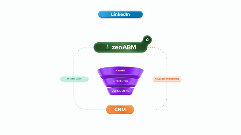
Ready to create high-performing LinkedIn ads? Start with ZenABM to track which accounts engage with your campaigns and iterate based on real data.
Based on my analysis, top performers (2%+ CTR) typically include: a CTA button in the image (47%), FREE or limited offers (41%), real people or diagrams (35% each), and dark backgrounds with bright text (35%). Zero top performers use generic stock photos.
Median CTR is 0.42%. Anything above 0.5% is solid. Top performers achieve 2%+ CTR – over 5x the median. By comparison, Thought Leader Ads average 2.68% CTR.
No. My analysis of high-CTR ads found 0% used generic stock photography. Instead, use custom photography, branded graphics, diagrams, product screenshots, or real team photos.
Top performers use various formats: diagrams/flowcharts (35%), real people photos (35%), product screenshots (18%), and testimonial graphics (18%). Choose based on your message – but always custom, never stock.
Use high contrast (dark background + bright text), include a visible CTA button, feature real people or visual explanations, and lead with a specific offer or provocative statement. Avoid looking like every other corporate ad in the feed.